Friday, November 20, 2015

Colorizing

Before
Hello all of you out there in the world of the Internet, this post is going to show a quick tutorial about how to colorize a boring picture and make it something fantastic.

I mean really, doesn't that object look so much better now that it has a proper background and a rainbow smile. I think it does.

So for starters what you will need to do is choose a picture using some sort of free photo website or you can look on Google using the search tools and making sure the photo is one that can be reused.
After


Once you have chosen your picture you can go into photoshop and cut out the object you want to use for the picture using the pen tool. Click points all around the object and then up at the top of photoshop click on the make selection button. Once it makes the selection click on the new layer button and the object should appear in the new layer as long as it is selected.

Next is the part where you can let your imagination soar with all kinds of ideas that will help to enhance your image. Remember that each photo is different and should be tailored to its own needs. For the photo I used, I added a small circle around the logo at the top so it would sort of look like an eye. Then I added a inner and outer glow of the same color to make it stand out a little more. Next I used the pen tool to make a custom shape for the mouth and added a rainbow gradient for the fill. After that I added a gradient over the entire machine by first using the pen tool again to outline the shape of the machine, then I turned the outline into a shape by clicking on the shape button, and finally in order to make the object still visible I turned down the opacity to 50%. Lastly I added a picture for the background to make it all just come together.

Well there you go, a Crash Course in image enhancement.

see you soon people of the internet.
Jake Smith

Thursday, November 5, 2015

What the Font?!?!?!?!

       This is unbelievable folks, something so amazing has happened that Jake is almost too excited to to tell you. For this first time in web class history the teacher has let us use the fonts we want instead of having to go mainstream and use the normal bland fonts. It feels like some kind of weight has been lifted off Jake's shoulders and Jake can now breathe easier. For the first time in this class Jake feels free; Free to make his own choices and finally have the design of his dreams. Jake believes that this is the beginning of a beautiful relationship between Jake and the new fonts of the world.

       Ok people, pleasantries aside today I am going to teach you how to find and use different fonts that you can use through the future world tyrant Google. So for starters it is a good idea to make sure you are in the right place or you will get lost easily.

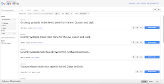
       You will need to go to https://www.google.com/fonts, from there you can search around until you found the web font of your dreams, or at least one that is close enough.


       Next you will need to click on the little box that has an arrow pointing to the right.


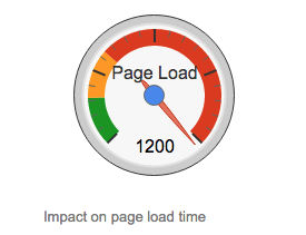
       When it takes you to the next page you then have some choices, you can choose the different options there but be careful because this can be a danger to your site because if you use too much it can seriously slow down the loading on your site.


       Once you have made all of your choices you will need to look for the box, as shown to the right, that says standard, import, and javascript along the top. Once you see it click on import, than copy the text that is on the inside of the box.


       Go to your site on dreamweaver and paste this text at the top of your CSS code. Hopefully it should look like this when you put it in.

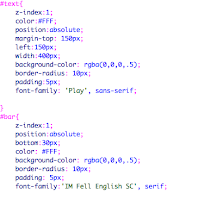
       Next, in the CSS, type up the font family CSS and then look back on the font site. Back on the site it will show you what you need to type in, it is a better idea to type this one in instead of copying because dreamweaver is weird with apostrophes.

      Your coding that says font family should look pretty similar to the coding here, just like normal but with the web fonts of your choosing.

       Now would be the opportune time to test it, go ahead and save and preview if it works you should see your new font. If it didn't work then you did something wrong because my directions are so awesome you can't mess them up. No really If it doesn't work then go through the steps again.


Well that is all people, have fun and use your web font choices for good. I know I won't, so until I type again,

Jake Smith


Wednesday, October 28, 2015

BEWARE THE JABBERWOCK!

       Yes that is right dear readers, I have recreated the absolute terror from the whimsical world of Lewis Carroll. A large cave is located in the deepest darkest parts of the internet where this monstrocity preys upon the lesser of websites. A place so remote you can never find it unless the beast is dragging you there to be devoured.

       Ok, ok if you really want to see it here is the link. (link) I am going to be kind enough to let you see the Jabberwocky in its natural habitat. I may release a murderous website, but I'm not so cold-hearted that I won't let you see it.

       So really this was a project that mainly focused on the CSS of a website (that's the coding that makes it pretty for those of you out there) and use just that to make it look awesome. This lesson was based off of a website called the CSS Zen Garden where it is the same exact website but with all kinds of amazing designs by ordinary people who know how to speak the language of the beautiful code.

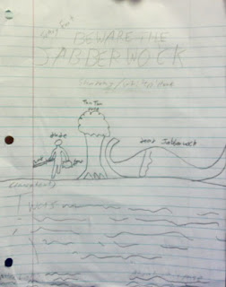
       So basically the information was handed out to everyone and the goal of it was to make it look like a decent website. For my idea, I wanted to go with something that felt creepy without actually being overly creepy. Unlike my 'work of art' right there the website turned out pretty good. The sad thing was that I had to put names next to everything so I would still know what it was.

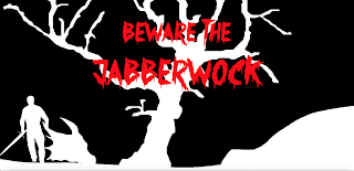
       As I went through the project I was very pleased with the results and came pretty close to my original idea, and the changes I made only seemed to make it look even more amazing. For those of you too lazy to click on my gracious link... I have added in screenshot for you. YOUR WELCOME!!!

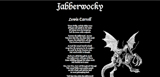
       Throughout the entire project the only part that seemed to be really complicated was making the main picture. In order to make it easier I looked at a couple of pictures online and then did a sort of outline of it. The end result: Mind Blowing.

       Learning wise this was a good refresher for the most of the CSS learned last year. Mainly due to the fact that it is hard to remember all of it when you don't really have any of the programs at home, I mean what kind of nerd would have that at home. Ha... haha... Ok so maybe I do want  it... who are you to judge my life. Other than that there wasn't much new stuff to learn, after all the teacher was just like "here is the HTML. Don't mess with it but make a website. Make it look like you care." Apparently there was some bitterness on one of the days of this project, because the teacher almost blatantly told us to fix them up so it looks like we care, so I decided to leave early that day.

       All in all this didn't take me too much time, I had an idea pretty quickly and followed through with it. I would have been finished with it sooner but for some odd reason Dreamweaver deleted all of my code when I tried to save so at the most it took me about three days to do. The other two days I spent tinkering around with it so my creation was absolutely perfect.

       Well I have now answered all of the questions and my hands are starting to cramp up from typing so long. So, until I begin to feel better readers I am still as always...

Jake Smith

Friday, October 2, 2015

Don't Make Me Think

       You are probably wondering what that title is all about? After all, usually I just shout a bunch of techno babble at you that you probably need to look up. This time I can say without a doubt, will be completely the same.

       For this assignment I was forced against my will to read a packet and do worksheets, BLEH, and read about all of the things that make a good website.I didn't sign up for this, I signed up to mess around on a computer! But enough ranting, you want to hear all about what I did on the worksheets don't you.

       For starters I had to look for a website that was very distracting or it wasn't too obvious what exactly was going on. So after a while one was found that looked awful. It was called Partial Preterism and it really had no indication of what was important, all it did was throw a bunch of words on to a screen and tried to see what stuck.


A good example of a website that was the opposite of this was one called Background Burner. It was nice and simple and there wasn't anything really distracting about it, until you look around and see a sumo picture, I mean come on, you can't not look at a sumo picture.


So next was a terrible site where there is absolutely no indication of where to click until you look really hard and notice the lines underneath the links that are put in the middle of blue writing. If you are going to make a link make sure it is CLEARLY VISIBLE, otherwise it gets very irritating and confusing. Oh yeah, the website is called Liberty Van.


But on the opposite end of the spectrum is the center of the world wide web, The Website Center. It was a nice clean little website that actually showed you where you can click to go to other places. Thankfully you could tell because the links were together at the top.


So here is someone clever enough to make a website that shows everything wrong you can do with a website. It is horribly colored, the distractions on the website are too numerous to count, and the spacing on everything is abominable. This place is appropriately named The Worst Website Ever. This is an example of terrible spacing because I needed one and I couldn't use the same examples over and over.

 A great website with good spacing is none other that The Whitehouse Website, and I'm not just saying that to keep the feds away. It actually had good spacing and everything was clearly defined to where you could tell what was separate and what was together. I tried to think of other jokes I could put on here but I quickly got bored.


So, before I get into this one, here is some info you are going to need to know. Conventions are the use of an image to represent something under a different meaning, it has a synonym called symbolism. On the Walmart website (hehe, advertising) it has a shopping cart that represents the shopping you are doing on the site.


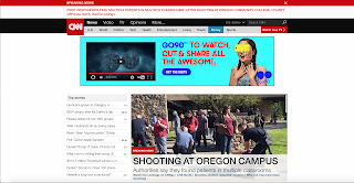
Finally, an awesome example of hierarchy, which is the showing of how something is important compared to everything else, was the site CNN.
 It had good example with different stories being more prominent that others.


That's it for this post, until next time,
Jake Smith

Wednesday, September 30, 2015

Random Websites

Hello people with nothing better to do than read my blog. I am back with another project that I worked like a whole 20 minutes on. What I had to do was look at sites and identify the "question marks," a question mark is the quick questions you don't even know you ask yourself when looking at a website because they are over very quickly. Mainly web creators use these questions to know what not to do on their website. For example...


 This website called Sunshine on Site was my first stop to finding other random sites. It didn't really work out so I put it on here. The main questions that came into my head was at first, where do I begin? There is both a menu and sidebar which made it very confusing to know where to find stuff. The other one I had was if that green button in the middle was clickable or not. It looked like a button but it could have also been a colorful title.


 Another wonderful website I found was the Passive Aggressive Password Machine. This site is pretty good if you are in the mood for a little confidence bruising as it will call you multiple names and hope that God has mercy on your email account. The main confusion with it was that all of the instructions were hidden under the green box at the top and it never said that you needed to roll the mouse over it to see them. The other thing is that unless it is explained to you you don't really know what to do until you see the directions.


And lastly, the Hotel Wifi Test which I didn't really look into that much because I was too bored with this to care. For starters it was sort of unclear that the pictures were links and you wouldn't know until you moved the mouse over the picture. Plus the fact that the menu at the top is so small that it is very difficult to see and have to actually look for it.


anyway there is my rant about three random websites.
until next time,
Jake Smith

Tuesday, September 29, 2015

The Paint Place

I have done it! I have finished my first client project!

Well... ok, so it was a fake client... Big deal! I still finished so that is at least something.

Anyway, yes i am back with another awesome website made by yours truly. This site is about all things paint for a guy I made up called Peter Painter. Pretty clever huh, i know, i'm so proud. But this site included what we have learned so far which meant we had to do it the hard way.

What we did was take a theme we liked from the list of themes given through Wordpress and rewrite some of the coding to make it our own. In other words it is another childtheme project. The name of the (fake) store is called The Paint Place. Isn't my teacher so creative and original? But all in all the actual product didn't turn out too bad. I used the theme called Kindergarten which was the closest to the look the "client" wanted for this site.

 This right here is my home page, it is two pictures because the screen capture wouldn't fit all of it in. On the home page it has a small little picture slideshow of random paint scenes, the Painter's Decree, and a link to comments put in by the users of the web (not really, those are just me).


 We had to include several pages that had to revolve around the idea that this was an actual site for an actual company. For starters there was an inspiration page that talks all about Peter's life and why he wanted to start the Paint Place. Nowhere, Oklahoma is an actual place, you need to search that up.


 This page we had to put in store locations, so a map of Kansas was put on the page with pushpins showing where all of the stores were located. The map even includes major highways and streets so you won't get lost.


Here we had to include a learning center page so I decided to make a program called the Paint Pals, i'm almost as clever as the teacher. It is a program for small kids where they can learn about paints and colors, but mostly to make sure that each child is happy with who they are and to accept that everyone should be themselves (except when you are yourself, then admitted to a psych ward). Because what child program doesn't teach that to kids right?


 Here is the brands page cut up in three parts. It shows all of the brands of paint that the store buys including themselves at the bottom because they mostly make their own paints. For this page I actually created all three logos in a span of about twenty-five minutes. You can probably tell that by the simplicity of them. But the three brands are Royal Paints, Rainbow Riders, and my favorite of the three Paintscape.


We also had to make a page called colors, so at first I tried to copy and paste the code for an interactive color wheel, but that ended horribly and greatly messed up the code. So instead I added a link to the site instead. It basically says the you can look at the color wheel and decide what colors you like, then you can go to the store and tell them the code for the color you are looking for.


This right here is the logo for the site which was the very first thing we needed to make. It was actually kind of fun to have to think up something from a simple idea as paint. There were some limits though; for instance we had to include the name of the company and it had to look "good" or something. All in all i'm actually very happy with how this site turned out.


Well, that is all I got for you right now
Until next time,
This is Jake Smith

Tuesday, September 15, 2015

The Wonderful World of Wordpress

       So in the huge world of my web class there has been some buzz of a little something called Wordpress. So of course the first thing you Noob coders may ask might be "What's Wordpress?" Well I will tell you that and so much more!!! (Because it's assigned)

       For starters there are two different types of Wordpress; there is .com and .org. Wordpress.com is a way for you to create a blog through Wordpress, where Wordpress.org is a "Well-Architectured personal publishing system," basically it lets you make a website. Wordpress was made in this world as an open source content management system and was actually based off another program called cafelog. In other words they are both a CMS or content management system as it was said above. 

       Wordpress is actually more common than what is first thought. It is actually used on a multitude of common and well known sites like TechCrunch, The New Yorker, BBC America, The Official Star Wars Blog (Come on, I had to put it in.), and Variety. In fact, out of the top 10 MILLION websites of the words Wordpress is used on about 24.4% of them. You do the math, that is a lot of websites.

       Of course though, Wordpress is not the only CMS used. There are others including, but not limited to, Joomla and ModX which are also pretty popular in the CMS area of the web.

Well it looks like I have answered everything that I HAD to. If you would like to see where I got my info from you can click on the links below next to the corresponding questions.

What is the purpose of Wordpress.com?

What is the purpose of Wordpress.org?

How did Wordpress originate?

What is Wordpress based on?

What is a CMS?

What large, well-known sites use Wordpress as a CMS?
LINK

What percent of the top 10 million websites use Wordpress?
LINK

Name two more commonly used CMSs besides Wordpress.
LINK


Until the next assignment or unless I get bored and decide to talk about something worthwhile,

Jake Smith

Friday, August 14, 2015

I'm Back!!!

       Yes that's right I am back for another whole year of blog posts! Summer is over and i'm now back to the place of torture known as school, but I don't think it will be all that bad (yeah right). We have already been assigned a project which is basically what i'm showing right now. But enough about me, how about I tell you about the project.

       We had to take a subject and find a photo of it on four different free stock photo websites. The subject I chose (if you didn't already look at the pictures) was the horrible and creepy octopus of the land. It can make a silk web to ensnare it's victims. That's right the haunter of nightmares, the Spider!

       The four sites used were morguefile.com, pexels.com, gratisography.com, and unsplash.com. These all had amazing photos but it was a competition and i have cast the votes and chosen winners for the categories.

       The winner for the best photo goes on over to the website of PEXELS!!!! I mean come on, this is a pretty cool picture of a spider. That thing is downright frightening, and not to mention it must be huge. So yeah, here is the winning picture. Although it has some pretty cool pictures; unfortunately it didn't have that many photos so it was kind of sad to know it only offered six pictures and then a link to another website for more pictures.


       And now, the winner for the website with the most photos. A name that automatically makes you think of zombies... MORGUE FILE!!!! This website was pretty good and had variety of photos to choose from. It made it quite fun to see all of them and I would probably choose this site as a go-to site in the future. Plus the pictures there were really cool too.


       The easiest website to download from would have to be (Drums please) GRATISOGRAPHY!!!! This website unfortunately only had one spider photo and the search bar is confusingly on the bottom of the website and it takes you to a search engine. But it was an amazingly quick download which was pretty cool.


Finally the easiest website to search, and last but not least, the only one left... UNSPLASH!!!! Ok ok I know it isn't actually a spider. But it was the only one it had so therefore it is the best! Leave me alone! This website was actually the easiest to use because it had all of it's pictures in a line on the page and the search was actually for the website. Unfortunately it didn't have the pictures I was looking for.


Well there we go, four incredible websites for free photos and now you know my opinions of them.

Until next post,
Jake Smith

Thursday, May 21, 2015

The Final Animation Post

       Well, here it is. Although I have had a lot of fun in this class and have done lots of cool things, this will be the last post for animation. I am moving on to bigger things and can no longer be held in this class.

       So for our Final project we had to team up with some friends and make a movie. But not just any movie, a blockbuster smash movie with all kinds of crazy effects. Just kidding, I mean this is high school, come on. Basically we had to make a movie using a green screen at least once and then use all of the types of effects we learned over the year. Which included using one 3D object made in Maya.

       What we first started off with was making an idea for the movie. Our original idea was making a robot fight, but later on it turned into super powers. Next we made this story board with such lovely pictures drawn by yours truly.  After that we went into the filming stage, where we began to film all of our shots. It took about a week to get all of our shots, and even then we still have one missing (we realized this after the movie was already made). The worst part about the filming was the Kansas weather where it was rainy when we started and then about 10 min. after we were done for the day it got nice again.

       Along the way I learned many things, for instance how to shoot mini blue spheres from my hand. Actually I learned that nothing will ever go the way you expect it to. We had to do certain scenes several times just to make sure we have the shot just right. I also learned that I now have more respect for movie makers because there job is stressful and hard to do. I learned that trying to make a fire beam is very hard work. It was also a learning experience when I was taught how to work a green screen.

       If I was to do this project differently I would definitely start with making sure the story is not so cheesy. I will admit that the story is not the greatest, but it's pretty good for high school. I would also make sure there are absolutely no shadows when doing the green screen. You can't really know how bad this is without actually experiencing it, but just trust me it's bad. We just covered it up with a dark image background. That is my friend Madison, the friend who is my sworn enemy in the movie is my other friend Tim. Click on his name to see his blog; Madison didn't want her blog on here.

       Something I would do the same would probably be the fact that it was fun while we were filming. Even though our scenes aren't the greatest, we still had a lot of fun doing it. I think that I will take a lot of the effects that I have learned how to do with me because they could work in a multitude of scenarios.

       All in all I would call this project done with and deserving a spot it all of the theaters of the world. But because i'm feeling nice, i'll let you watch it for free. (Click on watch)

Until I feel like typing again,
This is Jake Smith

Wednesday, May 20, 2015

The Final Web Post (at least for the year)

It is finally the end of the school year, i'm sure we are all very excited. As a final project we had to update our index page (Which you can see at www.eravensonline.net/students/674jrs22). Throughout all of this we put up some of the highlights of the year including a photo composition website, our own animated GIF's and so much more.


My favorite project would have to be the Real or Hoax site we did somewhere in the middle of the year. I have always loved the stories of myths and legends and read just about every available book there is on them. In this site we had to make pages for several stories and then show them all in a single website.


This summer I plan on going to a retreat called Stubenville. It is a great religious retreat where several churches come together to meet and deepen our faith for God. I also plan to hit the pool if it ever stops raining. Even though I will be doing that stuff I also plan to help out a little bit as well. There is a thing going on at my old elementary school where people can volunteer to make and then serve food for the kids who are unable to afford it during the summer.


Next year I plan to delve farther into Web Design. After taking it for a year i have found it to be very fun and would like to continue to do it. I also see as a small part of it, graphic design, so this way I can kind of learn two things in one class. Sure it isn't the main focus of the class but it is definitely needed when making a website. All in all this has been a pretty great year.


Until I feel like typing again,

This is Jake Smith


Friday, March 27, 2015

Responsive Web Design

       So, I'm sure your first question is 'what is responsive web design?' Well I'm glad you asked; responsive web design is a change in a website so it can change depending on the device being used. Say for instance you use your phone instead of your computer. On some websites there will be a significant difference in how the website looks. It's still the same website but with a different format to make it easier to navigate and find stuff.

       It may not sound like much but responsive web design can make a huge difference for a company or organization. If you were in charge you would want to reach as many people as possible without something as silly as the website being too big to stop you from showing off your products and ideas. With the growth or more mobile technology it is pretty much impossible to ignore. Not to mention the fact that it saves more money than having to make three different websites (one for desktop computers, one for tablets, and one for phones).

desktop computer
       At this point I'm sure you're dying to see what I'm talking about so here are some visual aids to aid your visuals. This is a screenshot of One, an organization formed to help stop the poverty and spread of disease around the world (mainly in Africa). This website is definitely a responsive website in the fact that you can change the dimensions of the site and it will adjust accordingly.
tablet
mobile phone


First off, there is a notable difference in the computer screenshot and the tablet screenshot. The computer shot has an obviously different layout than the tablet. Instead of the pictures being next to each other the pictures change and are now on top of one another and the same goes for the phone screenshot. The pictures are right on top of each other. In the tablet shot the pictures become bigger than the computer but in the phone size the pictures get smaller to adjust. 

       The text size also changes, in the computer you can see a line below the pictures saying to join the fight against poverty, but can't see it in the tablet and phone. That is because it became smaller until it couldn't get smaller then moved to the bottom of the screen. 

       The menu also changes in the phone as you can see all of the links are on top of one another instead of side to side.

       The content changes as well, if you look closely at the pictures you notice that the stories organize themselves in order of importance. The main story stays near the top where it is clearly visible and the other stories just kind of fall in line.

       All of this overwhelming information is done through media queries which look at the capabilities of the device and is used to check things like dimensions of the window and device, the orientation, and resolution.

       But don't worry there are things called breakpoints which help to gather info on a program during it's run. It helps to debug and get more information on what is happening at that time.

Until the next post,
This is Jake Smith