For this assignment I was forced against my will to read a packet and do worksheets, BLEH, and read about all of the things that make a good website.I didn't sign up for this, I signed up to mess around on a computer! But enough ranting, you want to hear all about what I did on the worksheets don't you.
 For starters I had to look for a website that was very distracting or it wasn't too obvious what exactly was going on. So after a while one was found that looked awful. It was called Partial Preterism and it really had no indication of what was important, all it did was throw a bunch of words on to a screen and tried to see what stuck.
 A good example of a website that was the opposite of this was one called Background Burner. It was nice and simple and there wasn't anything really distracting about it, until you look around and see a sumo picture, I mean come on, you can't not look at a sumo picture.
So next was a terrible site where there is absolutely no indication of where to click until you look really hard and notice the lines underneath the links that are put in the middle of blue writing. If you are going to make a link make sure it is CLEARLY VISIBLE, otherwise it gets very irritating and confusing. Oh yeah, the website is called Liberty Van.
 But on the opposite end of the spectrum is the center of the world wide web, The Website Center. It was a nice clean little website that actually showed you where you can click to go to other places. Thankfully you could tell because the links were together at the top.
So here is someone clever enough to make a website that shows everything wrong you can do with a website. It is horribly colored, the distractions on the website are too numerous to count, and the spacing on everything is abominable. This place is appropriately named The Worst Website Ever. This is an example of terrible spacing because I needed one and I couldn't use the same examples over and over.
 A great website with good spacing is none other that The Whitehouse Website, and I'm not just saying that to keep the feds away. It actually had good spacing and everything was clearly defined to where you could tell what was separate and what was together. I tried to think of other jokes I could put on here but I quickly got bored.
 So, before I get into this one, here is some info you are going to need to know. Conventions are the use of an image to represent something under a different meaning, it has a synonym called symbolism. On the Walmart website (hehe, advertising) it has a shopping cart that represents the shopping you are doing on the site.
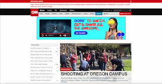
Finally, an awesome example of hierarchy, which is the showing of how something is important compared to everything else, was the site CNN.
It had good example with different stories being more prominent that others.
That's it for this post, until next time,
Jake Smith


No comments:
Post a Comment