Monday, September 19, 2016

P & A Jewelry Co.

       I put out a post a while ago that described the beginnings of an idea for a company. After working with it for a while, I finally have some more stuff to show. For starters, the logo has been made, passed many judgements and has risen to its full glory.
       After many drafts and ideas, only a few made it to the actual computer rendering. It then came down to two main ideas for the final basis of the logo. After getting many different opinions it was still unclear which idea the general public liked better. So, being the creative genius that I am, I combined the two of them.

       Several tweaks and revisions later the final product came to light. It was now official. The Peters and Anderson Jewelry Company was officially born. I might also add that I am quite proud of my company child.

       Now that things were rolling it was time to really make a name for the company. I began with a shirt, because it was before we started the next part of the project and I needed to look like I was working. Using the vast array of resources found on the internet I used my logo and put it onto a maroonish purple shirt while in a golden text. Both of these were the ideas I made but personally I prefer the one on the right.
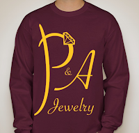


       Really this was done just to see what the logo would look like in different colors. Up until this point I hadn't done anything with the color of the logo except leaving it in black and white. 

       I'd call it a rousing success in all colors.


       Later on, I was given the scope of the next part of the project. We needed to make sure that our idea would work in both big and small scales.
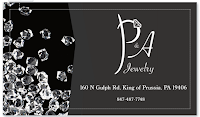
       The first thing I created was a business card once again using the vast resources of the internet. Since it was a jewelry company I wanted the business card to look sparkly and diamondy. So I put diamonds just about everywhere I could on the card. In hindsight I probably should have put more focus on jewelry and less on the diamonds.

       After that it was really just a matter of reusing images to create the wording on the card. The address, which isn't real, is 160 N Gulph Rd, King of Prussia, PA 19406 and the phone number, also not real, is 847-487-7748. The location actually is based on the second largest mall in the U.S. called the King of Prussia.
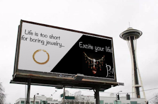
       After spending way too much time on the business card, I decided to go BIG! I wanted people to see my business no matter where they were. The highway would be my next advertisement gimmick. I took the liberty of helping to cover up someone else's ad so they could graciously make room for mine. This was just a quick make where I took some images and placed them on a black and white rectangle that was pretty close to billboard proportions. Unfortunately I was rushing and the logo is very difficult to see and is slightly cut off in the corner.

       Soon P & A was on the rise.
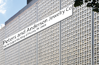
       We were growing at an enormous rate and soon had our own building. The name of the company shone gloriously on the side of the building. This was also done pretty quickly because I was running out of time to finish. I just typed into a rectangle and then skewed it so it would fit the side of the building.


Next I created a letterhead and envelope so people all over the world could see my business. The envelope was once again used with internet resources and is quite simple in the design. I feel as though the simplicity works well for both the letterhead and the envelope.

Lastly it was time to go mobile. My original idea was P and A Go so that it might trick people into thinking it was Pokemon Go but apparently that's 'immoral' or something like that. So the name was reduced to P & A. With this all I did was take the diamond from the logo and put it in a black box over a phone image. The quality is a little hard to see and I don't know why. I tried to take several pictures but they all looked worse. You get the main gist of it though.

       Well, that is all I have for P & A jewelry for now. so until you all hear from me again.

Jake Smith


Monday, September 12, 2016

The Art Thief


       Today I am not a tech geek in high school, on this day I am an article reviewer geek in high school. The difference is astounding. I have just recently read chapter one of a book called Steal Like An Artist by Austin Kleon, and besides repeating the same exact message over and over,
the book had some interesting things to say.

The Book


       The main point that this book stated was that nothing in this world is original; everything artistic has been stolen from another idea. Which to me just raises the question, what was the original idea that was stolen from? Anyway, it talks about how artists look at the world surrounding them for inspiration and then use that inspiration to influence the art that they make. The best way to do that is to always be curious and gain knowledge that will coincide and sometimes clash with the inspiration.

       The book uses a multitude of examples to show all the different ways that art can be 'stolen.' One of the best examples was "1 + 1 = 3." Imagine two lines parallel to each other, now count them. There are two black lines and in the negative space there is a white line making a total of three lines from an original two. Nothing has changed, but a completely new concept has sprung forth from someone taking the idea and changing it.

My Critique


       As I read the first chapter, I would be lying if I said the book had taught me nothing. The ideas are quite obvious and placed out neatly enough for me to understand. The language was nice and there weren't any confusing words or boring textbook explanations. It was made for the average man who is interested in simply stealing like an artist.

       While it did raise some excellent  points it seemed as though it tried too hard to look 'creative.'  The handwriting font gave it a bit of an unprofessional feel. The images also made it seem really basic and unfinished. When people think of art they expect something that doesn't look like a three year old who just discovered how a marker works. The images felt too simple in structure for the message the book was  trying to convey.

Summary


       All together the article was definitely something that I would look at again if I needed help making art. Everything inside of it flows cohesively and every new idea always pointed back towards the main theme. Even though I have only read the first chapter I may look into actually finding the rest of the book so that I can take a more in depth look at this creative spin on how art in any form is born.

Jake Smith


Friday, September 2, 2016

Project Proposal


The Beforehand

       I have been forced onto inspiration! Given four sheets of paper with random stuff on it, I have come up with the greatest business ever! I had to come up with an idea for a company using: diamond, panda, 846, and the letters A and P. So after an excruciating 10 minutes. I finally came up with the mandatory 5 ideas.

       The ideas I had were Panda Diamonds, The Diamond Panda, Panda 846, Pandiamonds, and the winning idea was P and A Diamonds.

The Company

       At P and A we guarantee that you will be a completely satisfied customer. We are nothing more than simple jewelry experts who only want happiness for whoever sees our products. We have a multitude of precious stones from across the globe but specialize in diamonds. Our location in Arlington, Virginia is ideally located near several diamond mines so you can be sure that our products are pure. We will not rest, we will not stop until you have the exact jewelry that you need. We assure everyone that our prices are fair in every way.

This message was paid for by the P and A Diamonds corporation.

Thursday, September 1, 2016

Meet Them All

http://www.eravensonline.net/students/674jrs22/webclass/webclass1617.html

Caitlyn's photo isn't working. I don't know why and yes, I have tried everything to fix it. Please do not comment on it.

Thursday, August 25, 2016

The beginning of the end!

       That is right! This year will be my very last year writing blogposts... in high school. It is finally senior year and I can't wait for all the perks! Senior games, special lunch areas away from all the other years; it'll be great.

       But just because it is my last year that doesn't mean that I still won't log on every once and a while to torment the web with my posts. For instance...

Adobe CC: What new and Happenin'


       For the first project of the year we had to choose something new that appeared in the Adobe updates over the summer. In the project I chose I actually went off the beaten path a little bit and instead of explaining the actual project I did I explained something that had been confused during the project.


My Project

       I was watching the instructional video on lynda.com and the project was taking an image and making it look textured using other pictures. I will say that we did not spend very long on the project so unfortunately it hasn't been finished. Yet.

Choosing Images

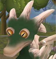
       Step one was to find a base image. The photos from the video were unavailable so the creative juices began to flow. In the project the instructor was using a goblin base and using a scaly texturing. Wanting to do something close to that I went with a dragon creature that I had created on a PC game called Spore. I used this image because it was a simple in shape and already had little to no texturing in the first place. 

       The next step was to find images that would have the textures that I would be looking for when creating my new and improved creature. The main photos were of alligators and snakes for the scaly texture that would go on the face and eyes. I then found a picture of a ram and a cattle skull to make the horns that were on the top of the head.

Starting in Photoshop

       Finally I had the materials needed to go ahead and start working in photoshop. First the base image was put onto photoshop and then turned into an art board layer. this was done by right clicking on the layer in the layers panel and then clicking art board from layers. Next was to bring in all of the texture pics and all of these pictures would need to remain as layers for it to work. In order to do that the images would have to be dragged off of the art board and into the surrounding space. At this point it was a good idea to rasterize all of the layers if they weren't already, just because it made it easier to mess with them.

The Base Image

Once all the images are in their respective places the next thing to do was to make sure the base image layer was selected, then go up to image, then adjustments, then click on levels. Adjust it slightly so that the some of the details on the base image are visible. That will help to decide where to put some of the other images later on. Next take the base image and turn it into a black and white image. The coloring would happen later on with the layers that will be put on the image.


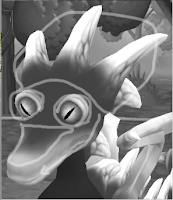
The next thing to do is to highlight some of the different parts of the base image. In the art board on a different layer take the paint brush and begin to circle some of the areas that will use the textures. In this I circled the horns, eyes and snout because those will be the main area of my focus. Also notice the arrow on the side of the snout; it is showing the direction of the head and will also direct some of the scaling later on.


Once you are done with that start another layer in the art board. Still using the brush tool take the color from some of your images and begin a simple sketch of how you want the layout to look. It doesn't have to be exact or all that pretty but it helps to give a basic idea of the direction you want to go in.


Putting in the Layers

Once you have an idea of what you want to put on and where click on the layer of the image you want to use. Use the lasso tool to circle around the texture or shape you want to use. For this I went with one of the eyes. After the lasso is complete click up on the select and mask button. This was the new part that I showed because before hand it used to be just the refine edge tool. The new button shows several different tools that you can use. The main focus is on the feathering slider; just mess with it so it has a little bit of that blur around the edge. Click Ok once you are done. Next copy the image and then paste it into a new layer on the art board. Place it over the desired area and using the command button and T you can turn it and stretch it to your liking.


 Well that is all I have for now, This may be updated in the future with a more complete project.

Jake Smith

Tuesday, May 10, 2016

Extreme Homepage Makeover

       This is it! The Final project for the year! Goodness, it seems like this year flew past. Of course, most of it I spent complaining that school was a tortured eternity. Either way, it is finally coming to a close and that of course means one thing: finals. Those dreaded test that are completely meaningless to everyone. The final for web was actually a complete shocker, the teacher wanted us to make a website! Totally unguessable!

       Anyway, in this project we had to search for a high school website that was... not exactly superb, to put it into nice terms. This did not take long and I had many contenders up for the part; eventually though, I settled on Lodge Grass High School. With this site it was difficult to tell where to even start. From the random image floating in the center of the page to the menu that covered itself up when moving from one subject to the next, this was definitely something that needed some work. The biggest thing that just made me grind my teeth at this site was the fact that there was no home button. It took me several minutes to find one until I figured out that the main feathered logo was the home button.

       Next we had to go and find a business site that we felt we could replicate. After a long hard search that lasted a grand twenty minutes I found an interesting site called Kekselias. It was a great site that had all kinds of economic jargon that helped to make me completely confused. It was a decent design that uses some coding that we learned but didn't dwell on for very long.

In this project we are going to essentially convert the high school website to look like the business site. We are going to be redesigning everything, from the logo to the overall layout, to look more like the business site which is why we needed to choose something that we could recreate.

More posts to come about the same project,
Jake Smith

Tuesday, April 19, 2016

Attack of the Mobile Devices

       There here... There small... They follow you everywhere... and it's already too late. The mobile devices have taken over; controlling the minds of everyone who comes into contact with them! The have expanded world wide and now they have begun to take over the internet!

       Yes mobile devices, those small little pocket sized computers that basically render everything else obsolete. Over the last several years mobile devices, mainly phones, have steadily increased in internet usage. Over a span of four years mobile device usage to visit a site has increased by more that 100%. This has greatly affected the use of other internet usage devices like desktops; for instance, their usage has gone down by nearly 50% to visit a site. Obviously this trend is not going to go away anytime soon and most likely the usage for mobile will continue to increase.
       Just because usage is up, that doesn't necessarily mean that mobile versions are more liked. The bounce rate for mobile, which is the percentage of visitors who navigate away from a site after visiting one page, has gone up in recent years. This is basically stating that even though mobile internet usage is on the rise, it is not capturing as much attention as normal desktop use.

       Many other places have the data to back this up. Yes I know the internet can't always be trusted, but the sources had to be from the web. These three sources go to show that mobile is on the rise and may eventually take over any other form of internet usage.