Tuesday, April 19, 2016

Attack of the Mobile Devices

       There here... There small... They follow you everywhere... and it's already too late. The mobile devices have taken over; controlling the minds of everyone who comes into contact with them! The have expanded world wide and now they have begun to take over the internet!

       Yes mobile devices, those small little pocket sized computers that basically render everything else obsolete. Over the last several years mobile devices, mainly phones, have steadily increased in internet usage. Over a span of four years mobile device usage to visit a site has increased by more that 100%. This has greatly affected the use of other internet usage devices like desktops; for instance, their usage has gone down by nearly 50% to visit a site. Obviously this trend is not going to go away anytime soon and most likely the usage for mobile will continue to increase.
       Just because usage is up, that doesn't necessarily mean that mobile versions are more liked. The bounce rate for mobile, which is the percentage of visitors who navigate away from a site after visiting one page, has gone up in recent years. This is basically stating that even though mobile internet usage is on the rise, it is not capturing as much attention as normal desktop use.

       Many other places have the data to back this up. Yes I know the internet can't always be trusted, but the sources had to be from the web. These three sources go to show that mobile is on the rise and may eventually take over any other form of internet usage.

Monday, April 18, 2016

Flash (but not the superhero)

       Hello out there to all seven of my viewers. It has been a while since I have posted but that is mainly because my instructor was going through some hard times and hasn't been back since spring break. Thankfully he is back now and things are starting to get as close to normal as they can.

       Anyway, Flash! It is a great program for doing all kinds of animation stuff (why in web design? I have no clue.) But it is another adobe program that lets you do all kinds of cool stuff. I am still trying to find all of that cool stuff. 

       In this project I had to create a scene of a house with mountains in the background. After that I was told to create a sun, cloud, and bird. Those are the main animations in the scene. Flash is somewhat tricky because in this you have to make almost every frame. Thankfully there are short cuts that allowed me to make the animation go from one spot to the next without making all of the frames over and over again.

       Next are the little secrets that I have hidden in there just for you. If you click on the chimney and the land octopus they will also animate. They were both turned into 'buttons,' which is what they are called in flash. I am going to give a link mainly because SWF files do not work so well on this site.


I am running out of time and words so...

Jake Smith

Wednesday, January 20, 2016

The Mysteries of the Code

       Here today I am going to list three things from two different websites that I would like to learn how to do in the future. The websites I used was Krispy Krush (not Krispy Kreme) and The Harvard Gazette because why not.

       From Krispy I found that it had a menu that would stay on the screen even when you move around on the screen. This is something I have thought about doing in a website, but since I don't know how to do it I haven't done it yet.


        Next I found in the footer a little area that had images that would move side to side either on its own or with a click on an arrow. This interests me because I would like to know how to make little areas like those that can hold more stuff than what is first seen.
       Lastly on Krush I found an area where the divs would move and disappear if you clicked on a button. To some degree I know how to partially do that using some javascript but I have not attempted to make multiple divs move at once. This seems like a good challenge because it is based on something I actually know how to do.
        Next on the list I decided to go to college and scout out the competition. On the Harvard site I found a news page... area... thing where there was a div that had multiple stories moving side by side. It is one of those divs that have the dots at the bottom and each one makes the main image change and link to a different story. I think this would be interesting to find out how to do especially since it is used quite often with news sites and others.

        Next I found a button that will allow you to move to a certain part of the page. Here I clicked on one of the categories and it moved me down the page to where the category was. This would be interesting to use because it can apply to other stuff and not just news. Im not entirely sure how I would use it but I think it would be fun.


       Lastly, I found a menu button that would open up sub-headings. Once again I think I have learned how to do this, but this time I'm not one-hundred percent sure. I have several ideas of how to do it but as of yet I haven't put any of them in effect.


So here I am once again signing off to no one in particular,
Jake Smith

Thursday, January 14, 2016

Logo-Palooza


       There comes a time in every designers life when they must learn to grow up. They must rise to the challenges of life and be ready for anything. For me that time is today, for today I have created my own logo. This means that now I am truly a 'prafeshinal' web designer. These logos are supposed to be a way of showing who we are through a simple image. For mine I decided to go with a j that was wearing glasses, I figured it was something that was pretty simple and showed a part of me.

       The process of logo making is a long one with revision after revision. The first thing to do when making a logo is to make sure you know what the main idea is... what message are you (or your client) trying to show through the image. This can be done in multiple ways from the shape of the logo to even the type of color you choose.

       When I started my process, the parameters of the design was something that would be personal as to who I was. When I sat down and thought for a bit I decided to start with something alongside my astrological sign or my Japanese animal. Since I was born on November 22nd, 1998; my animal was the Tiger and I have seen many different astrological items say different things so I consider myself to be both Scorpio and Sagittarius. After looking at the three, I decided that Scorpio was out mainly because scorpions are generally connoted as something negative even though they can be seen as a symbol meaning importance. I figured that if clients saw the logo I don't want them to automatically have a bad feeling about me. The Tiger I considered but ultimately didn't choose because while it is a majestic and colorful creature, an animal just didn't feel right for who I was. I did not want to be thought of as a creature with basic competence that ran purely on instinct. In the end I decided to go with the elegant and graceful Sagittarius Bow.

        As you can see, many sketches went into that idea but eventually it got too out of hand and I started to only focus on the fact of it being an arrow. I do think that some good ideas went into the arrow idea but I had come to the realization that it didn't really seem to fit the point of the project. Yes it could represent me but I think it was too finite of an image to really represent me as a whole. So after wasting an hour and a half of arrow sketches and coming to my realization, I decided to take a break.


       After I no longer felt like I would go crazy if I saw a bow or arrow, I decided to just start over on a fresh page. I decided to start with something that was slightly unique to me and started making sketches using my name. I am a bit of an origami fan and started with making the letters of my name using lines to make it look like it was folded paper. I also tried to make some sort of jagged cursive that didn't really seem to work out. Eventually I got an idea to make a little stick figure who would look like he was walking. I'm still not really sure why I thought of that since it had nothing to do with my train of thought in the first place but it did help me to come up with my main concept.


       After drawing some more sketches and ignoring the stick figure I got bored and decided to give him a face. The beautiful thing was when I drew the face, everything clicked together. I thought about how the lower case j looks a little bit like a stick figure with a floating head. I decided to draw the face on the dot of the j; although later on I realized that it made the head look a little busy. So the next thing I did was simplify it down to just the glasses on the 'head.' This sketch was used with some graph paper so it would make it easier to find the right proportions. Each little space in between was equal to about 10px (pixels). You can see some of the partially erased lines on this sketch, I started with those lines by making a blocked version of the idea I was going with. The large curves alongside the bottom were the hardest part to proportion. The was mainly for the reason that the small curves I made were only 10px so I could just easily connect them from one point to the next. With the bigger ones it didn't work out the same way and I wasted about 15 minutes trying to connect it from point to diagonal point while keeping it curved.


       Once the rough sketch revisions were done I placed a sheet of blank paper on top of the revision and traced the sketch completely. The end result was still a bit rough but that didn't matter too much considering the final logo would be made on Illustrator.


       Now that the sketch was done it was time to start thinking about what to do with colors. Believe it or not, colors can make or break logo without anyone ever realizing it. Each color has different subliminal meanings that most companies use in order to make you want to buy their product. It really is quite interesting to know what colors can make us feel or think. If you want to see the site I used for my color decision you can see it here. I used the color orange in the start because it meant creative, and that is kind of how I liked people to think of me. As you can see though that did not become my final decision.
Completed mesh


       In Illustrator it was pretty uneventful up until it came time to actually apply my idea for more of a 3D look using the colors. The hook on the J was difficult because it was not compatible with a normal radial or linear gradient. After getting some expert help, I was told that a gradient mesh might work well with the shape. A gradient mesh is an item that you can use to make a shaped gradient. It can also allow you to input custom points for color changes within the shape. Once that was done my logo was finally complete.

       The next step included, once again, colors. We had to choose several different colors and then get a public concensus and see which color they would like the best for the logo. The three colors I chose were orange, blue, and black. The opinions I got were from two people in my class named Morgan and Allyson. Both automatically said that blue was their favorite of the three, so in the hands of the people my final logo came out blue.


I can't really think of what else to say so...
until next time,
Jake Smith

Friday, November 20, 2015

Colorizing

Before
Hello all of you out there in the world of the Internet, this post is going to show a quick tutorial about how to colorize a boring picture and make it something fantastic.

I mean really, doesn't that object look so much better now that it has a proper background and a rainbow smile. I think it does.

So for starters what you will need to do is choose a picture using some sort of free photo website or you can look on Google using the search tools and making sure the photo is one that can be reused.
After


Once you have chosen your picture you can go into photoshop and cut out the object you want to use for the picture using the pen tool. Click points all around the object and then up at the top of photoshop click on the make selection button. Once it makes the selection click on the new layer button and the object should appear in the new layer as long as it is selected.

Next is the part where you can let your imagination soar with all kinds of ideas that will help to enhance your image. Remember that each photo is different and should be tailored to its own needs. For the photo I used, I added a small circle around the logo at the top so it would sort of look like an eye. Then I added a inner and outer glow of the same color to make it stand out a little more. Next I used the pen tool to make a custom shape for the mouth and added a rainbow gradient for the fill. After that I added a gradient over the entire machine by first using the pen tool again to outline the shape of the machine, then I turned the outline into a shape by clicking on the shape button, and finally in order to make the object still visible I turned down the opacity to 50%. Lastly I added a picture for the background to make it all just come together.

Well there you go, a Crash Course in image enhancement.

see you soon people of the internet.
Jake Smith

Thursday, November 5, 2015

What the Font?!?!?!?!

       This is unbelievable folks, something so amazing has happened that Jake is almost too excited to to tell you. For this first time in web class history the teacher has let us use the fonts we want instead of having to go mainstream and use the normal bland fonts. It feels like some kind of weight has been lifted off Jake's shoulders and Jake can now breathe easier. For the first time in this class Jake feels free; Free to make his own choices and finally have the design of his dreams. Jake believes that this is the beginning of a beautiful relationship between Jake and the new fonts of the world.

       Ok people, pleasantries aside today I am going to teach you how to find and use different fonts that you can use through the future world tyrant Google. So for starters it is a good idea to make sure you are in the right place or you will get lost easily.

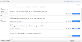
       You will need to go to https://www.google.com/fonts, from there you can search around until you found the web font of your dreams, or at least one that is close enough.


       Next you will need to click on the little box that has an arrow pointing to the right.


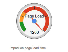
       When it takes you to the next page you then have some choices, you can choose the different options there but be careful because this can be a danger to your site because if you use too much it can seriously slow down the loading on your site.


       Once you have made all of your choices you will need to look for the box, as shown to the right, that says standard, import, and javascript along the top. Once you see it click on import, than copy the text that is on the inside of the box.


       Go to your site on dreamweaver and paste this text at the top of your CSS code. Hopefully it should look like this when you put it in.

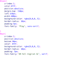
       Next, in the CSS, type up the font family CSS and then look back on the font site. Back on the site it will show you what you need to type in, it is a better idea to type this one in instead of copying because dreamweaver is weird with apostrophes.

      Your coding that says font family should look pretty similar to the coding here, just like normal but with the web fonts of your choosing.

       Now would be the opportune time to test it, go ahead and save and preview if it works you should see your new font. If it didn't work then you did something wrong because my directions are so awesome you can't mess them up. No really If it doesn't work then go through the steps again.


Well that is all people, have fun and use your web font choices for good. I know I won't, so until I type again,

Jake Smith


Wednesday, October 28, 2015

BEWARE THE JABBERWOCK!

       Yes that is right dear readers, I have recreated the absolute terror from the whimsical world of Lewis Carroll. A large cave is located in the deepest darkest parts of the internet where this monstrocity preys upon the lesser of websites. A place so remote you can never find it unless the beast is dragging you there to be devoured.

       Ok, ok if you really want to see it here is the link. (link) I am going to be kind enough to let you see the Jabberwocky in its natural habitat. I may release a murderous website, but I'm not so cold-hearted that I won't let you see it.

       So really this was a project that mainly focused on the CSS of a website (that's the coding that makes it pretty for those of you out there) and use just that to make it look awesome. This lesson was based off of a website called the CSS Zen Garden where it is the same exact website but with all kinds of amazing designs by ordinary people who know how to speak the language of the beautiful code.

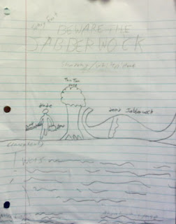
       So basically the information was handed out to everyone and the goal of it was to make it look like a decent website. For my idea, I wanted to go with something that felt creepy without actually being overly creepy. Unlike my 'work of art' right there the website turned out pretty good. The sad thing was that I had to put names next to everything so I would still know what it was.

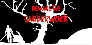
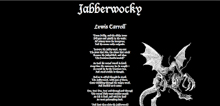
       As I went through the project I was very pleased with the results and came pretty close to my original idea, and the changes I made only seemed to make it look even more amazing. For those of you too lazy to click on my gracious link... I have added in screenshot for you. YOUR WELCOME!!!

       Throughout the entire project the only part that seemed to be really complicated was making the main picture. In order to make it easier I looked at a couple of pictures online and then did a sort of outline of it. The end result: Mind Blowing.

       Learning wise this was a good refresher for the most of the CSS learned last year. Mainly due to the fact that it is hard to remember all of it when you don't really have any of the programs at home, I mean what kind of nerd would have that at home. Ha... haha... Ok so maybe I do want  it... who are you to judge my life. Other than that there wasn't much new stuff to learn, after all the teacher was just like "here is the HTML. Don't mess with it but make a website. Make it look like you care." Apparently there was some bitterness on one of the days of this project, because the teacher almost blatantly told us to fix them up so it looks like we care, so I decided to leave early that day.

       All in all this didn't take me too much time, I had an idea pretty quickly and followed through with it. I would have been finished with it sooner but for some odd reason Dreamweaver deleted all of my code when I tried to save so at the most it took me about three days to do. The other two days I spent tinkering around with it so my creation was absolutely perfect.

       Well I have now answered all of the questions and my hands are starting to cramp up from typing so long. So, until I begin to feel better readers I am still as always...

Jake Smith