Ok, ok if you really want to see it here is the link. (link) I am going to be kind enough to let you see the Jabberwocky in its natural habitat. I may release a murderous website, but I'm not so cold-hearted that I won't let you see it.
So really this was a project that mainly focused on the CSS of a website (that's the coding that makes it pretty for those of you out there) and use just that to make it look awesome. This lesson was based off of a website called the CSS Zen Garden where it is the same exact website but with all kinds of amazing designs by ordinary people who know how to speak the language of the beautiful code.
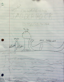
 So basically the information was handed out to everyone and the goal of it was to make it look like a decent website. For my idea, I wanted to go with something that felt creepy without actually being overly creepy. Unlike my 'work of art' right there the website turned out pretty good. The sad thing was that I had to put names next to everything so I would still know what it was.
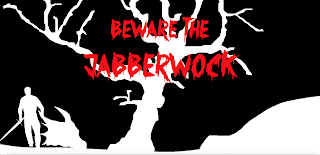
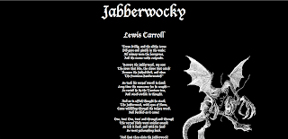
As I went through the project I was very pleased with the results and came pretty close to my original idea, and the changes I made only seemed to make it look even more amazing. For those of you too lazy to click on my gracious link... I have added in screenshot for you. YOUR WELCOME!!!
Throughout the entire project the only part that seemed to be really complicated was making the main picture. In order to make it easier I looked at a couple of pictures online and then did a sort of outline of it. The end result: Mind Blowing.
 Learning wise this was a good refresher for the most of the CSS learned last year. Mainly due to the fact that it is hard to remember all of it when you don't really have any of the programs at home, I mean what kind of nerd would have that at home. Ha... haha... Ok so maybe I do want it... who are you to judge my life. Other than that there wasn't much new stuff to learn, after all the teacher was just like "here is the HTML. Don't mess with it but make a website. Make it look like you care." Apparently there was some bitterness on one of the days of this project, because the teacher almost blatantly told us to fix them up so it looks like we care, so I decided to leave early that day.
All in all this didn't take me too much time, I had an idea pretty quickly and followed through with it. I would have been finished with it sooner but for some odd reason Dreamweaver deleted all of my code when I tried to save so at the most it took me about three days to do. The other two days I spent tinkering around with it so my creation was absolutely perfect.
Well I have now answered all of the questions and my hands are starting to cramp up from typing so long. So, until I begin to feel better readers I am still as always...
Jake Smith


