Friday, March 27, 2015

Responsive Web Design

       So, I'm sure your first question is 'what is responsive web design?' Well I'm glad you asked; responsive web design is a change in a website so it can change depending on the device being used. Say for instance you use your phone instead of your computer. On some websites there will be a significant difference in how the website looks. It's still the same website but with a different format to make it easier to navigate and find stuff.

       It may not sound like much but responsive web design can make a huge difference for a company or organization. If you were in charge you would want to reach as many people as possible without something as silly as the website being too big to stop you from showing off your products and ideas. With the growth or more mobile technology it is pretty much impossible to ignore. Not to mention the fact that it saves more money than having to make three different websites (one for desktop computers, one for tablets, and one for phones).

desktop computer
       At this point I'm sure you're dying to see what I'm talking about so here are some visual aids to aid your visuals. This is a screenshot of One, an organization formed to help stop the poverty and spread of disease around the world (mainly in Africa). This website is definitely a responsive website in the fact that you can change the dimensions of the site and it will adjust accordingly.
tablet
mobile phone


First off, there is a notable difference in the computer screenshot and the tablet screenshot. The computer shot has an obviously different layout than the tablet. Instead of the pictures being next to each other the pictures change and are now on top of one another and the same goes for the phone screenshot. The pictures are right on top of each other. In the tablet shot the pictures become bigger than the computer but in the phone size the pictures get smaller to adjust. 

       The text size also changes, in the computer you can see a line below the pictures saying to join the fight against poverty, but can't see it in the tablet and phone. That is because it became smaller until it couldn't get smaller then moved to the bottom of the screen. 

       The menu also changes in the phone as you can see all of the links are on top of one another instead of side to side.

       The content changes as well, if you look closely at the pictures you notice that the stories organize themselves in order of importance. The main story stays near the top where it is clearly visible and the other stories just kind of fall in line.

       All of this overwhelming information is done through media queries which look at the capabilities of the device and is used to check things like dimensions of the window and device, the orientation, and resolution.

       But don't worry there are things called breakpoints which help to gather info on a program during it's run. It helps to debug and get more information on what is happening at that time.

Until the next post,
This is Jake Smith

Wednesday, March 25, 2015

Desktop VS. Mobile


The mobile phone: an amazing device that allows you to literally carry a computer in your pocket. This device quickly became a sensation and now wants to achieve something much bigger. The phone plans to replace ... the desktop computer. Slowly at first, but now in a close match, both devices are trying to claim the number one search device. Coming soon, the tie will be even closer and the mobile phone may pass the age old computer.

 So now the question is, why? Besides just easier access what is really gained from the the mobile phone to the computer? Surely it's not for easier use? we have all tried to use our phone as a computer and... well... it just runs into the same problem. It takes forever to find the one small thing that you are looking for on a huge website that can fit maybe five words on the screen!

The bounce rate for Amazon is much higher on
phones than it is on a desktop computer.
to see more go to
http://www.clickz.com/clickz/column/2388915/
why-mobile-web-still-matters-in-2015
In a survey taken, the session time for a certain website was significantly less than the session time for a regular computer. Plus the bounce rate was seriously higher than a computer. A bounce rate is the percent of people that click away after looking at only one page (it usually means the website is boring or difficult). This shows that even though phones have risen there aren't a lot of websites out there that are device responsive. This makes it difficult for someone on the go who maybe just wants to look up how much a sandwich costs from a sandwich shop.


http://wearesocial.net/blog/2015/01/digital-social-mobile-worldwide-2015/
Not only that, but what would happen if the mobile phone took over the internet completely? We would all be stuck using small devices to search huge websites. It would be almost impossible to find anything we needed without some difficulty. Actually it is already happening in some parts of the world already. In India the phone pretty much dominates the internet usage there with second place desktop coming in at a measly twenty-seven percent and tablets filling in the last one percent.


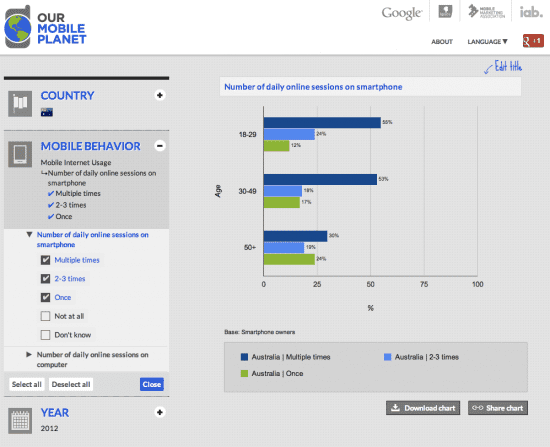
For example, in Australia they use their phones a lot during the day.
to see more go to
http://www.smartinsights.com/mobile-marketing/
mobile-marketing-analytics/mobile-marketing-statistics/
All in all it is pretty much inevitable that the phone will take over. So it might as well be as smooth a transition as possible.

Until the next post,

this is Jake Smith